A tool to monitor a telecom network performance
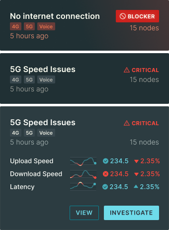
Imagine you look after a wireless network in a city. Your job is to fix issues(like an outage or a degradation of service) when they arise and figure out why they happened. You have a swarm of special devices imitating real end-user phones to measure the network performance.
The challenge? Present the vast amount of data to the operator and help him make decisions quickly and precisely. My goal was to design an interactive data visualization that may help to solve this problem.

Into the unknown
This project had unique challenges that made using a standard double-diamond process difficult:
- Complex Domain: Our team was unfamiliar with the domain.
- Limited Access to Test Participants:We couldn't source external test participants due to NDAs and budget constraints.
- No direct competitors:The niche market made competitor analysis difficult.
- Research & stakeholder engagement:We used open-source materials, including professional communities on Reddit, to learn about the domain and user needs. We validated our findings with subject matter experts among the stakeholders.
- User story maps:We created detailed user story maps and Jobs-to-be-Done frameworks, sharing only wireframes with stakeholders.
- Iterative process:We iterated extensively, using wireframes to communicate and refine our designs.
Data visualization: color scheme
We show 4 grades of errors:
| ⬤ | Node performance is worse that the median | ⬤ | Node performance is in the bottom 25 percentile, but still within the appropriate threshold. The end user may experience some discomfort (like a lagging videoconference) | ⬤ | Error: node performance is below the threshold. The user notices a severe degradation of the quality of service. | ⬤ | Outage. No connection at all. |
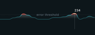
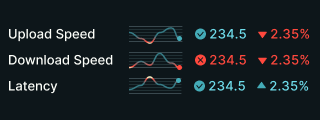
We want errors and outages to stand out, so we chose the contrast color scheme. I took inspiration from the pictures of glowing molten metal. Here is how it looks on charts.


Showing errors on the map
The map helps to find the geospatial relationships between the network error cases, for example, a cellular base station outage or a cable torn by construction workers. The telecom equipment may be concentrated in a few data centers, so the dots on the map would obscure each other. Usually, this is solved by clusterization like in this example below
Do you see the problem in this design? As an admin, I want to see even a single outage on a map wherever it happens, and when we cluster dots, we can show only one color for this aggregation, most likely the median. So we won’t see the outliers, which we need so much.
That is why we improved this map like this. Here, the dot size codes the error quantity and the dot color - the severity of errors. As the layers sit one on top of another, we can always see a single error even in a data center of 1000 units.