Meer
A vendor manager’s workplace design for a big European marketplace.
Problem statement
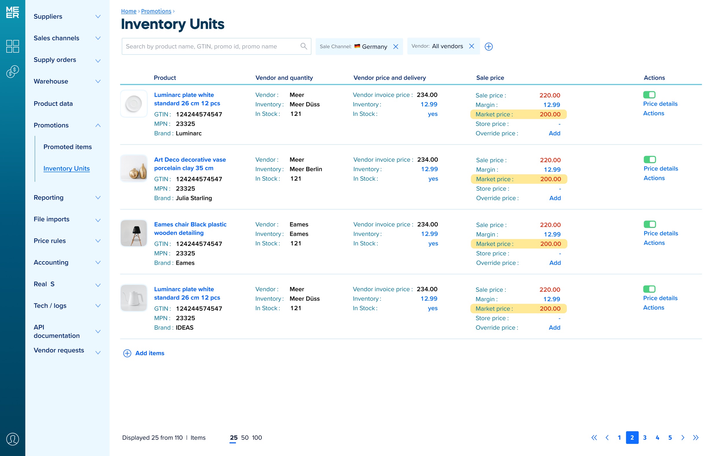
The stakeholders wanted to have a universal tool that helps the managers to plan the upcoming promotions for both the online marketplace and the printed leaflets. This involved defining promoted items, setting prices, vendor negotiations, and adjusting production plans for Meer's own brands. Timely completion before promotions launch was crucial.
Design process
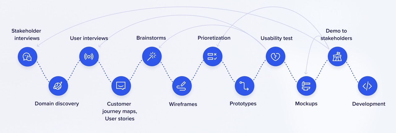
In this project, we had a complete UX process with user interviews and usability testing. By conducting interviews, I uncovered pain points and gained insight into the overall flow. Then I proposed a solution, illustrated with low-fidelity wireframes. Also, in this project I was among the people responsible for prioritizing features. After testing the improved low-fidelity prototypes, I made the high-fidelity prototypes and tested them on the users again.
Fernando
Vendor manager
The vendor manager is responsible for the promotion planning. He decides what items should go in the promo, sets the promo prices, and negotiates with the vendors. The last is, actually, his primary task. He needs to know if the price he is going to set is lo enough to be the best in the market but high enough for the marketplace to be profitable.
The items in my promotions should have the best price in the market and still be profitable
Olena
Operatoins manager
The operation manager looks after the stock, especially when the promotion is already running. She plans new orders and replenishments. Also, she consults the vendor manager when he sets the promotion items quantity.
The promo is running but we are out of stock. My job is to prevent this situation
Caroline
Product data manager
She checks the product data and description. Her job is to ensure the product data is valid and consistent. Currently, we have more than one place where the product data is stored, complicating her life.
I want to be sure we have the product data filled in for every product in our promo
Wireframes
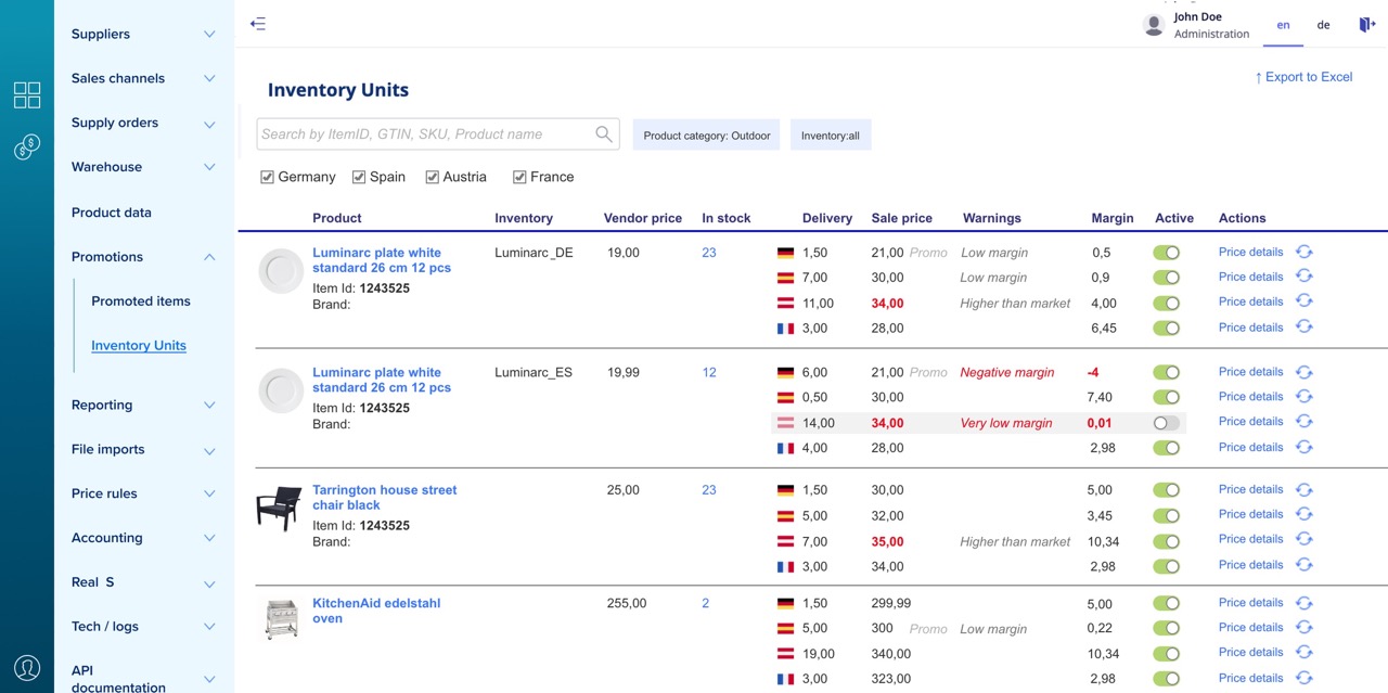
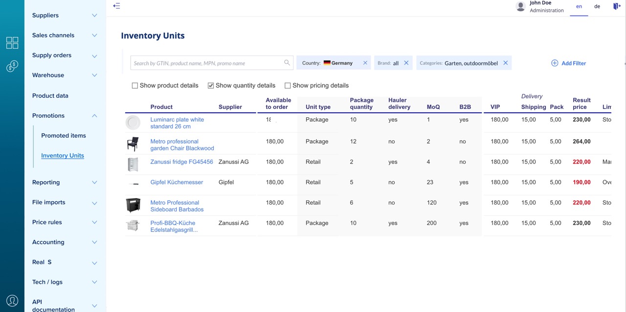
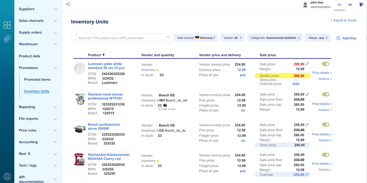
The grid would become very wide and require a horizontal scroll if we collect all the fields that a vendor manager, product data manager, and operations manager need. I tested several different ways of organizing the information:
The sidebar. Reduces the amount of horizontal space for the grid
The expandable table row. The areas used by different roles, are highlighted in red, yellow and blue. This solution adds visual clutter.
The separate page or a popup. Hides the page, needs an extra click to switch back.
